

There are many factors that may determine whether I pick up a book, including the title, what the book is about, definitely blogger recommendations, and book covers. Often times, I feel a bit bad, guilty even, when I choose to learn more about a book solely based on a book’s cover. First impressions can matter; it’s why there are so many adages about it. Covers often provide readers with their first impressions as well. I’m not saying that it’s exactly fair or that we shouldn’t look at the blurb. It’s okay to be drawn to a book because of the attractive cover. It’s meant to attract us! It wouldn’t be doing its job if it didn’t. Also, we shouldn’t feel bad about choosing a book based on a cover, because a lot goes into designing a book cover!
COVER CONSIDERATIONS
A number of decisions go into creating the perfect cover. A book’s cover isn’t just the front of the book, but includes the spine as well as the back of the book. The front of the book needs to be able to draw someone in so they’ll be willing to pick it up and read the description on the back. Hopefully, it will then lead to a purchase! There are different factors to consider. I’ve noted just a few. I don’t endorse any of the services provided from the posts I’ve linked–just thought I would put that out there. These posts were helpful in trying to gleam the complexities of designing a book cover.
- 99Designs by Vistaprint suggests one of the first steps is to understand the target audience so do the required research that will provide insight to the audience likes or wants. This can be as simple as looking at multiple book covers in the genre.
- Imagery might be one of the first things we as readers consider. Imagery can come from a number of places such as a book’s themes and scenes. Color palettes should be taken into consideration. Scribemedia suggests thinking about how the imagery might complement a title rather than immediately delving into images and photos right away.
- Making a decision about typography seems simple but deciding on the best typography includes taking into account type, size, color, location, spacing, and the list can go on. More complicated than it appears, right? According to the Creatopy blog, readability should be the main consideration when it comes to typography; people need to be able to read it. Here’s a list of from Creatopy, 20 Iconic Examples of Book Cover Typography.
There is a lot of information out there, but here are a few additional interesting blog posts I found using a quick Google search to learn more about designing book covers.
- Book Cover Design: Your 7-Step Guide to an Unforgettable Cover provides a quick guide of what to consider when designing a book cover. The beginning speaks to a more DIY approach while the latter part of the post is about utilizing a professional and why.
- Book Cover Design 101: How to Design a Cover that Sells provides additional considerations. I especially liked how it highlights the spine and back cover as elements that should not be overlooked.
- How to Design a Great Book Cover (Ultimate Guide) emphasizes the need to hire a professional book cover designer and provides a list of places to hire them. It also offers pointers about working with your book cover designer.
- How to Nail Your Book Cover Design (With Five Examples of What Not to Do), Kelly Notaras, an editor and founder of kn literary arts, also emphasizes the need to consider a professional to create a book cover and provides examples of covers (before and after) to support this view. Especially helpful is how Notaras provides information about the changes made to the covers. I found this one especially insightful.
WHICH WAS BETTER?
Yes! Appreciate the covers!
I thought it would be fun to make comparisons by asking the question “Which was better?” In other words, does the book live up to its cover or was it really just an effective cover? Was the inside just as good as the outside? Or, was the book even better????
I thought about utilizing a random process to pick the book covers, but I felt better about choosing covers I liked. Next time, I’ll think about comparing titles with books because titles can be one of the first things that draws readers in too. Sorry, got side tracked there. Maybe I’ll try out randomizing it another time, but for now, these are my favorite covers from my August reads.
- Self-selected 5 book covers I liked from among the books I read in August 2021. Coincidentally these were all books I enjoyed as well.
- Utilize my rating of the book and compare it with my rating of the cover. Different things went into the rating of the cover including color scheme, typography, theme, imagery, etc. It really varied on things that caught my eye too.
- Determine which was better? Was the cover better or was the book better? Or, could it be both? It could possibly be neither but I’m sticking with book covers I like.


I love the detail on the cover, and it reflects the story pretty well. See how a charm bracelet is emphasized here? This is a reread. If I had compared the two the first time around, I might have liked the cover more; but rereading it has given me an additional perspective on the story. The book is just as good as the cover makes it out to be.

Before I begin, I just need it to be known that Kennedy Ryan is superb. I love the cover because of the photo and the tone. There are so many emotions emanating from the photo too. The cover drew me in and that title…sooo good. It’s a deadly pair that made a strong first impression. The book is just as good as the cover (and title), possibly even better. However, I wasn’t a fan of the ending thus the equal love for the book and cover rather than mostly for the book. You’ll know exactly why Nix is The Kingmaker.

The colors and the use of the different fonts drew me in. Also, the tagline. It’s probably just a coincidence, but it feels like a nod to one of my favorite Taylor Swift songs, “Begin Again.” The cover as well as the title is representative of the story I found inside. Does a good book accompany the cover? Yes! I went back and forth on this one, but I’m sticking with liking both.


Okay. I can’t help it. I love when book covers in a series match. Maybe I cheated a little here since it’s book 2 in the All The King’s Men Duet. Again, it’s the colors, the title, and the tone. If we’re talking about a king, doesn’t the model exude confidence? Yes, yes, he does. The book is good–it’s written by Ryan so of course it is–however there are parts that I didn’t like as much. Is the cover representative of the book? Sure. In comparing the two, the cover drew me in but, while the book was good, I don’t think the book lived up to how much I liked the cover.
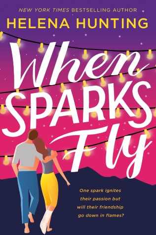
It’s another Helena Hunting title! I love the colors and the design. Like Good Luck Charm, the cover does reflect the story well. While I liked the book and the friends-to-lovers romance, in this instance I liked the cover a whole lot more. The cover did it’s job really well and drew me in but the book left me wishing it had as much sparks as the cover.
Are there covers you love that you think did the book justice? How about covers you loved where the book was even better than you expected? Or, how about books that were good but the cover may have hyped up the book too much? I’d love to know!

Leave a comment